Volleyball
Maré Nova Women’s Beach Volleyball Society
A fluid women’s beach-volleyball identity inspired by Brazilian beach athletics, tropical modernism and the continuous movement of tides.
01 / At a glance
A quick summary for clients and collaborators.
What this project is about
A fluid women’s beach-volleyball identity inspired by Brazilian beach athletics, tropical modernism and the continuous movement of tides. The case study presents the design direction across maré nova identity and tide emblem, primary women’s competition kit, alternate colourway, apparel detail system, beach-court environment. This case study documents the brief, creative direction, visual system, applications and production approach.
The collection needed strong colour and optimism without becoming raw streetwear, resort minimalism or generic wave illustration.
Two tide curves create an M in negative space while integrating a volleyball and rising sun, then expand into translucent overlapping colour fields across the kit.
Maré Nova identity and tide emblem / Primary women’s competition kit / Alternate colourway / Apparel detail system / Beach-court environment
Visual case study
Selected project work.
Large-format mockups follow the project context. Strategy, system and production details continue below.
Continue to project details ↓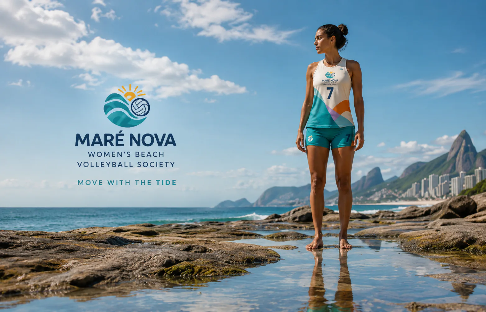
The Tidal-pool reflection mockup presents a specific Maré Nova Women’s Beach Volleyball Society touchpoint and is used to demonstrate the identity in a practical real-world context.
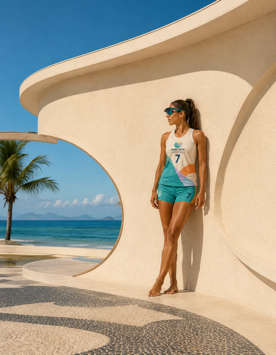
The Curved modernist architecture mockup presents a specific Maré Nova Women’s Beach Volleyball Society touchpoint and is used to demonstrate the identity in a practical real-world context.
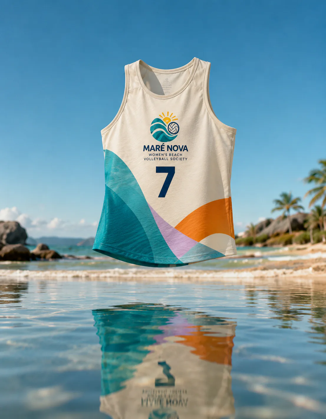
The Floating jersey above water mockup shows how Maré Nova Women’s Beach Volleyball Society is applied to apparel used by athletes, staff or supporters.
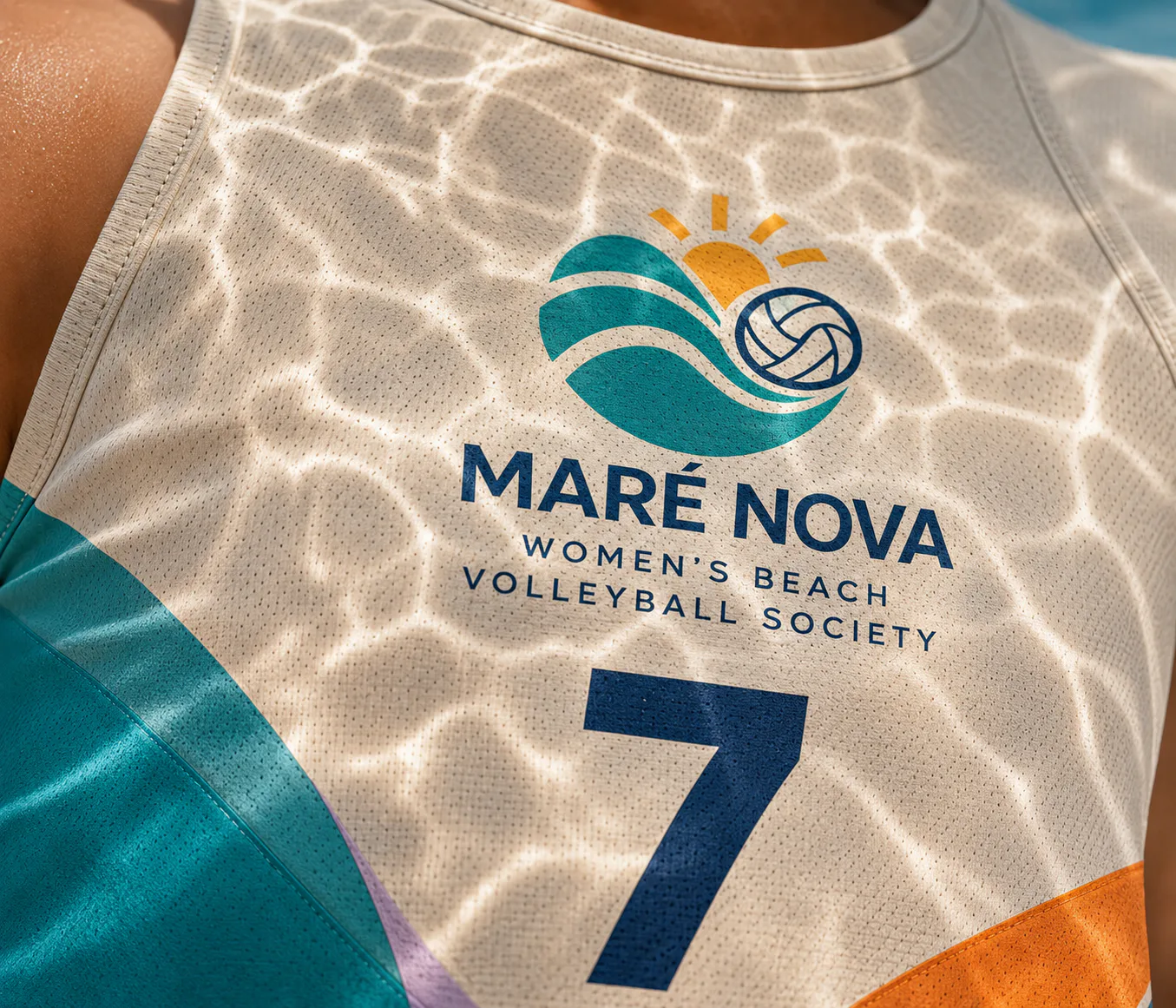
The Ripple-light macro mockup is a production detail used to verify how Maré Nova Women’s Beach Volleyball Society reproduces through material, texture and finishing.
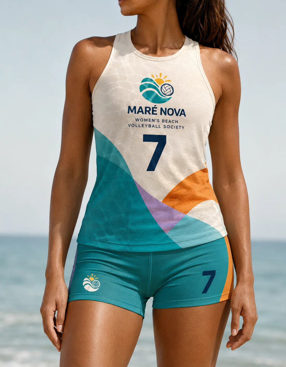
The Female apparel study mockup shows how Maré Nova Women’s Beach Volleyball Society is applied to apparel used by athletes, staff or supporters.
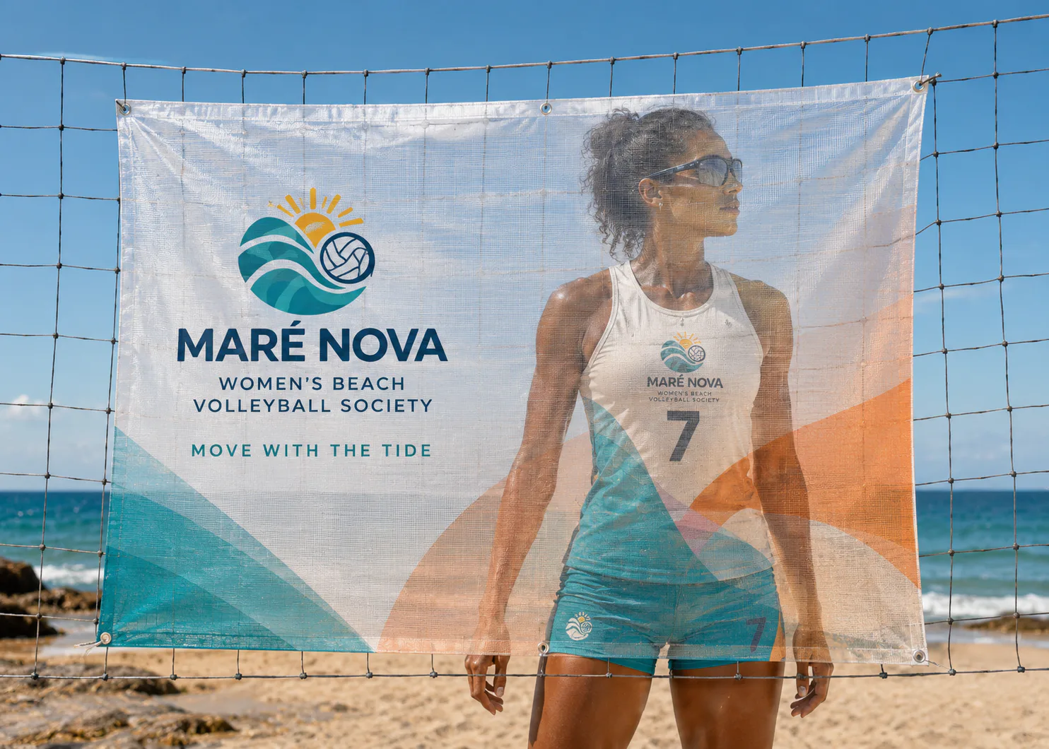
The Transparent wave banner mockup presents a specific Maré Nova Women’s Beach Volleyball Society touchpoint and is used to demonstrate the identity in a practical real-world context.
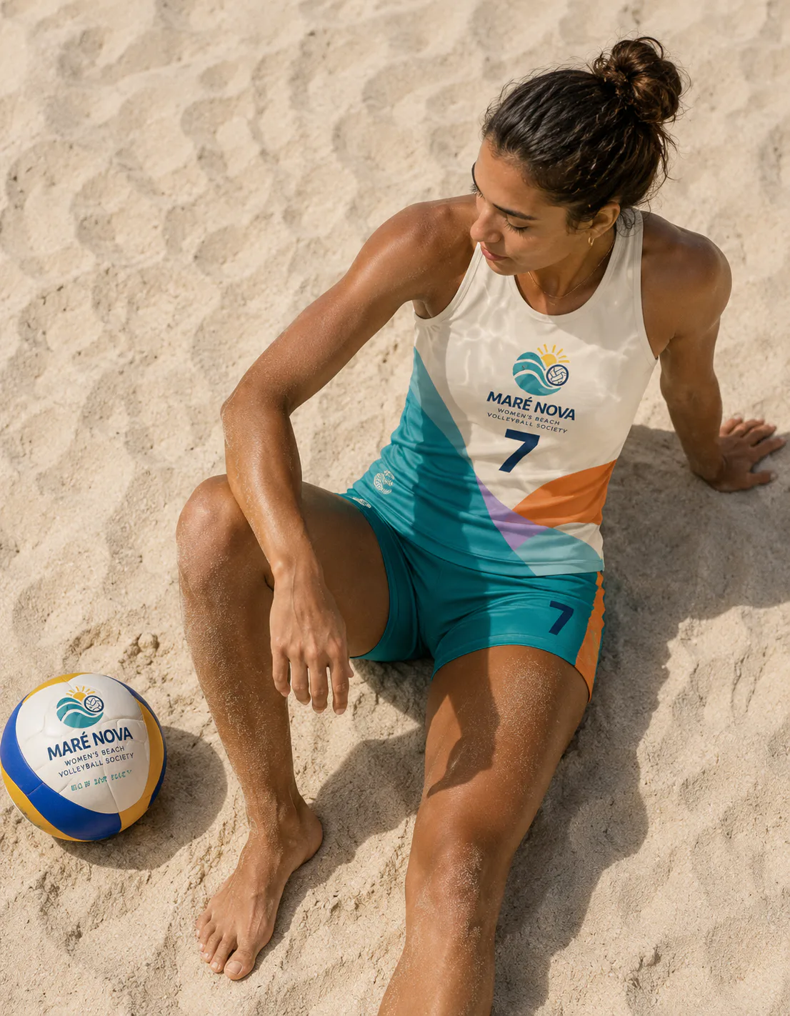
The Sand portrait from above mockup presents a specific Maré Nova Women’s Beach Volleyball Society touchpoint and is used to demonstrate the identity in a practical real-world context.
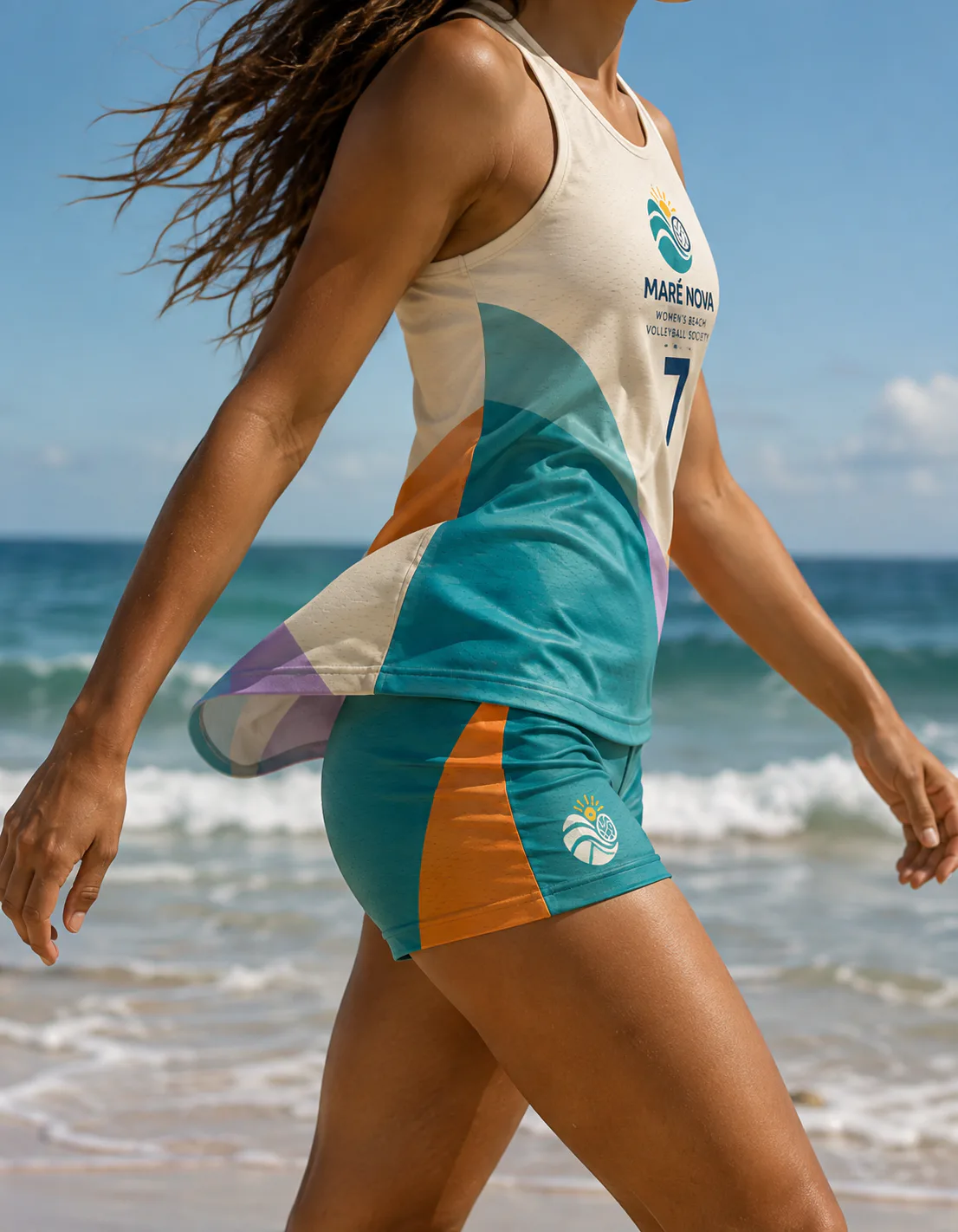
The Shoreline movement mockup presents a specific Maré Nova Women’s Beach Volleyball Society touchpoint and is used to demonstrate the identity in a practical real-world context.
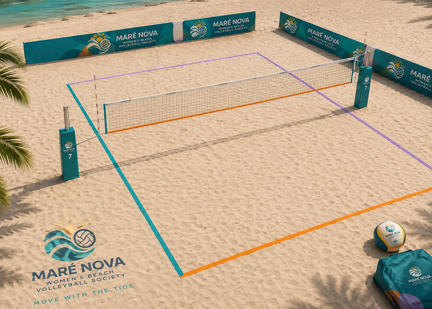
The Coloured boundary court mockup demonstrates how Maré Nova Women’s Beach Volleyball Society guides, informs and creates recognition within a physical space or event.
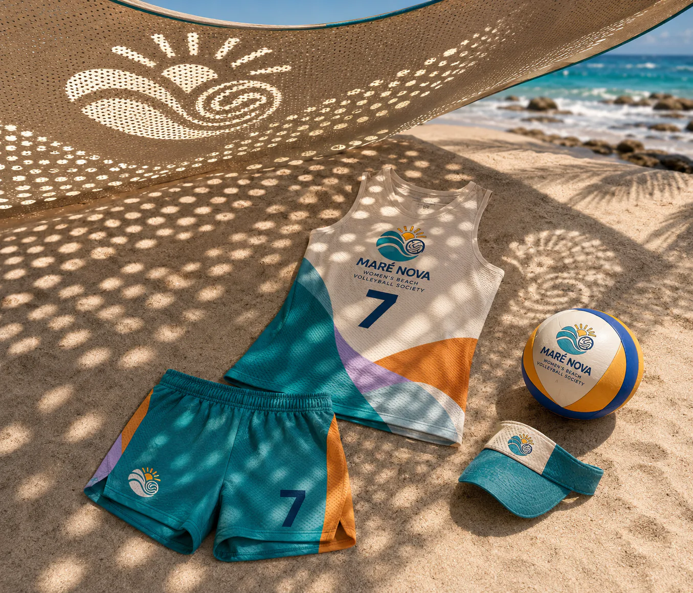
The Perforated shade projection mockup presents a specific Maré Nova Women’s Beach Volleyball Society touchpoint and is used to demonstrate the identity in a practical real-world context.
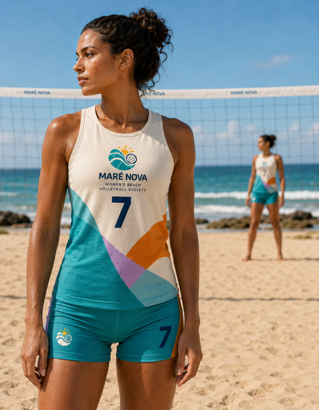
The Depth portrait mockup presents a specific Maré Nova Women’s Beach Volleyball Society touchpoint and is used to demonstrate the identity in a practical real-world context.
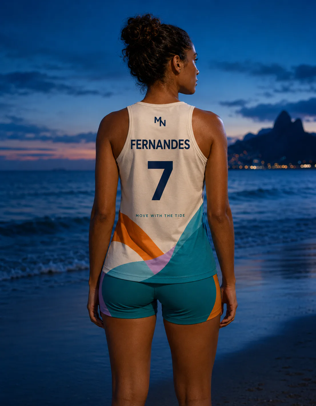
The Blue-hour jersey back mockup shows how Maré Nova Women’s Beach Volleyball Society is applied to apparel used by athletes, staff or supporters.
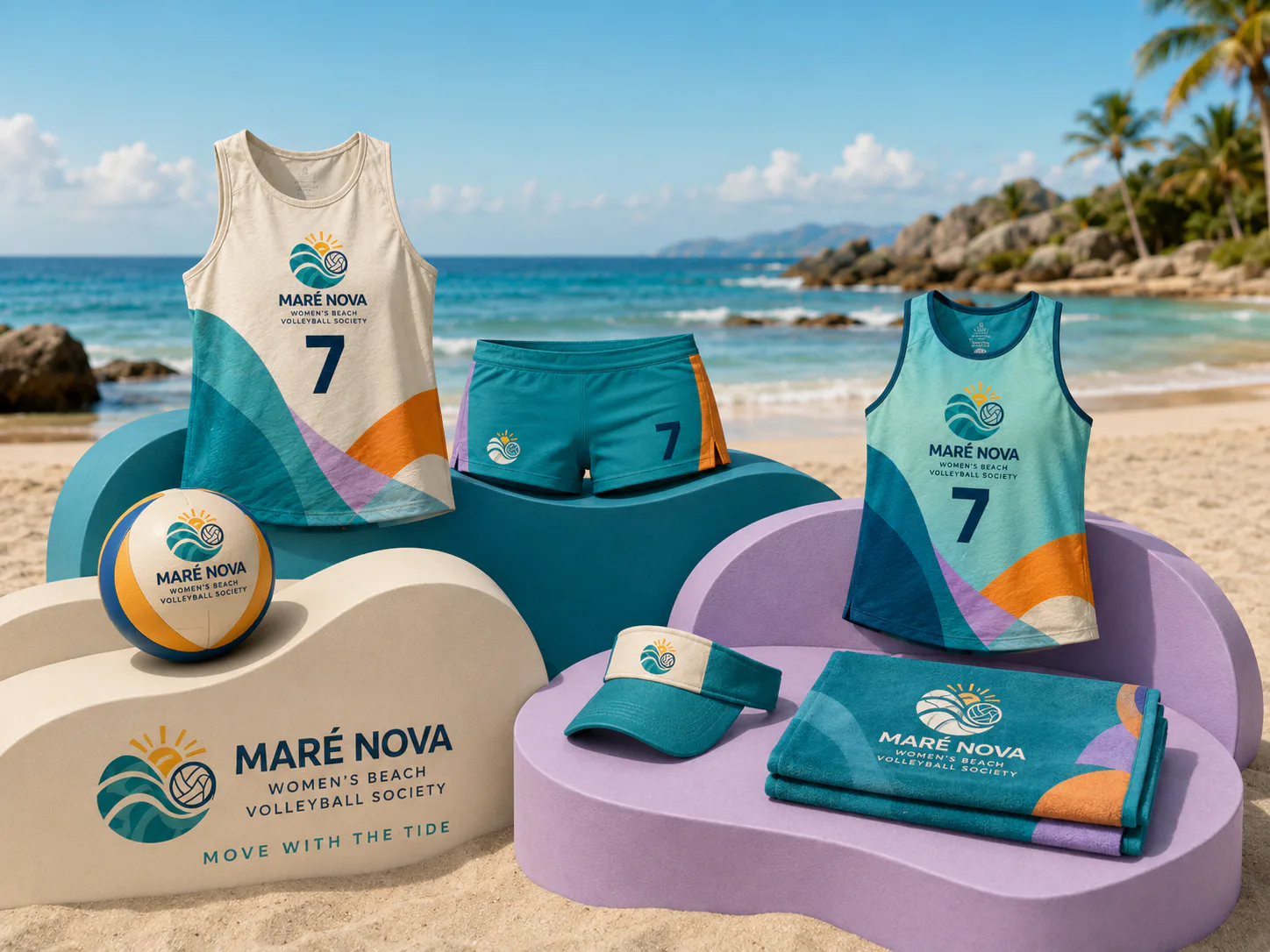
The Curved product platforms mockup demonstrates how people use and recognise Maré Nova Women’s Beach Volleyball Society through a practical screen-based experience.
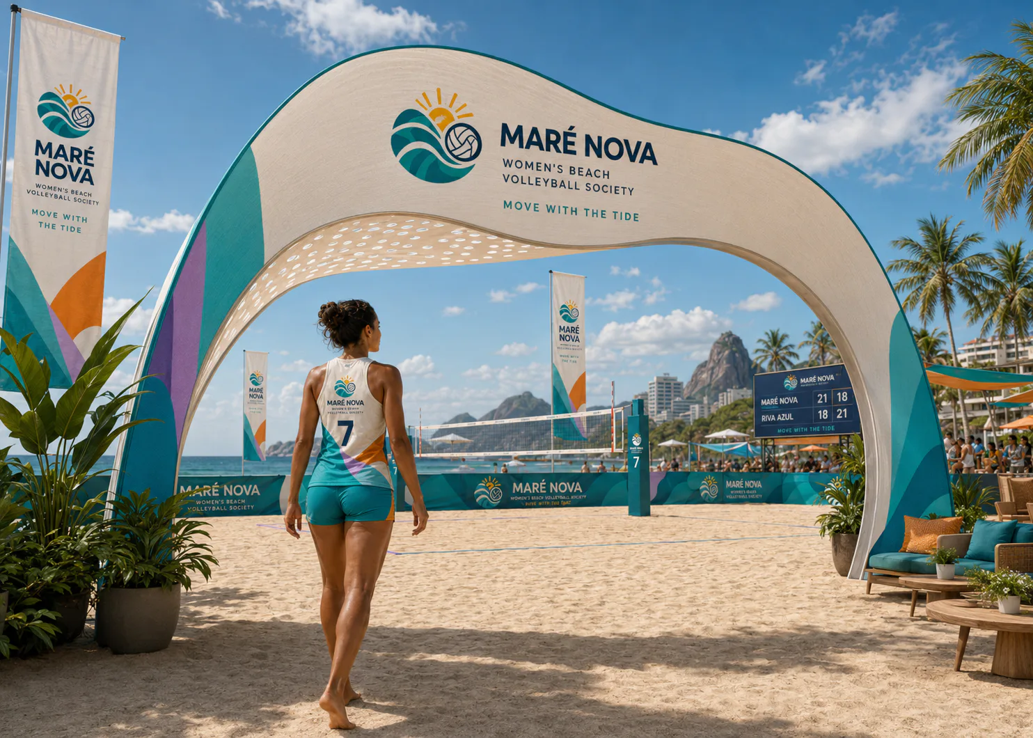
The Beach-tournament entrance mockup demonstrates how Maré Nova Women’s Beach Volleyball Society guides, informs and creates recognition within a physical space or event.
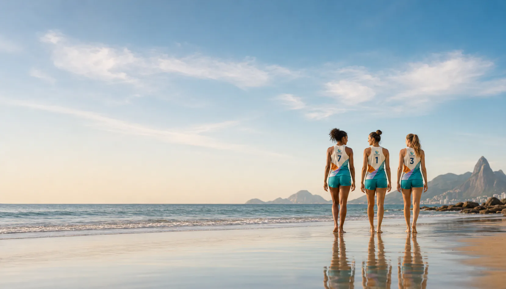
The Ocean closing image mockup presents a specific Maré Nova Women’s Beach Volleyball Society touchpoint and is used to demonstrate the identity in a practical real-world context.
02 / Brief
The challenge
Audience
- Competitive women’s beach-volleyball athletes and coastal clubs.
- Tournament spectators and contemporary beach-sports communities.
- International sportswear clients seeking colour, movement and a distinctive women’s apparel system.
Objectives
- Create immediate recognition from the smallest apparel mark to the largest event or campaign application.
- Build a coordinated system rather than a sequence of unrelated uniform mockups.
- Show prospective sports clients how identity, apparel, venue communication, sponsorship and social content can work together.
- Keep names, numbers, schedules, sponsor areas and calls to action clear in realistic use.
Constraints
- The same core logo, icon, number style, palette and garment artwork must remain consistent throughout the case study.
- Apparel graphics must respect seams, player-number legibility, sponsor clearances and realistic production methods.
- Event and digital information must remain readable at distance, on mobile screens and over active sports photography.
03 / Creative direction
The design response
Lagoon teal, mango orange, warm cream, deep ocean navy, soft lilac and small sun-yellow accents move through smooth curves, ripple textures and controlled asymmetry.
Two tide curves create an M in negative space while integrating a volleyball and rising sun, then expand into translucent overlapping colour fields across the kit.
04 / Design system
The visual system
A continuous M/tide/volleyball/sun emblem supported by rounded type and layered transparent-looking colour forms.
Lagoon teal, mango orange, warm cream, deep ocean navy, soft lilac and sun yellow.
A display face carries team or event character while a highly legible athletic family controls player names, numbers, schedules, divisions and sponsor information.
Primary, secondary and small-format marks follow fixed placements. Number scale, side-panel graphics, trims and equipment applications remain consistent across colourways.
05 / Applications
What the project delivers
Maré Nova identity and tide emblem
Maré Nova identity and tide emblem is designed as application 01 within the Maré Nova system, preserving the approved identity, palette, hierarchy and sport-specific production requirements.
Primary women’s competition kit
Primary women’s competition kit is designed as application 02 within the Maré Nova system, preserving the approved identity, palette, hierarchy and sport-specific production requirements.
Alternate colourway
Alternate colourway is designed as application 03 within the Maré Nova system, preserving the approved identity, palette, hierarchy and sport-specific production requirements.
Apparel detail system
Apparel detail system is designed as application 04 within the Maré Nova system, preserving the approved identity, palette, hierarchy and sport-specific production requirements.
Beach-court environment
Beach-court environment is designed as application 05 within the Maré Nova system, preserving the approved identity, palette, hierarchy and sport-specific production requirements.
Banner and entrance graphics
Banner and entrance graphics is designed as application 06 within the Maré Nova system, preserving the approved identity, palette, hierarchy and sport-specific production requirements.
06 / Production & implementation
Designed to leave the portfolio and enter production
- Prepare master vector wordmarks, emblems, one-colour variants, embroidery files and minimum-size tests.
- Supply garment placement diagrams with scale, colourway, number, surname, sponsor and seam-clearance specifications.
- Separate sublimation, screen-print, heat-transfer and embroidery artwork according to the intended production method.
- Build editable poster, schedule, result, player and sponsor templates with print-safe and platform-safe exports.
- Name and package final files by application, colourway, size and revision, with licensed-font and linked-asset notes.
Files should use a consistent folder structure, version names, editable masters, linked assets, licensed font notes and export presets. Final public content must pass a permission and privacy check.
07 / Iterations
How I developed the work
- Audit comparable clubs and events, then define the positioning and visual clichés the project must avoid.
- Develop several identity territories in one colour before selecting the mark that performs best on apparel and signage.
- Test the chosen system on the smallest emblem, the most information-heavy graphic and the largest environmental application.
- Refine garment placement, player-number clarity, sponsor hierarchy, colour contrast and photography consistency.
08 / Deliverables & outcome
What the project includes
Project deliverables
- Maré Nova identity and tide emblem
- Primary women’s competition kit
- Alternate colourway
- Apparel detail system
- Beach-court environment
- Banner and entrance graphics
Quality standard
- A prospective client can identify the sport, organisation and central visual idea within seconds.
- The full case study feels like one operational club or event system rather than unrelated generated images.
- Uniforms, equipment, signs, sponsor areas and digital content retain clear hierarchy in realistic contexts.
Project outcome
Maré Nova brings together maré nova identity and tide emblem, primary women’s competition kit, alternate colourway, apparel detail system, beach-court environment in one coherent, presentation-ready design system.
International portfolio relevance
This case study positions Rezaul Karim for sports identity, apparel, tournament and campaign work by showing how Maré Nova can operate across a complete client-facing ecosystem. It is especially relevant when approaching academies, clubs, event directors, apparel suppliers and integrated sports-marketing teams.
Further development
Further development can extend the system through additional applications, production testing, responsive refinement and implementation detail.
Have a similar challenge?
Let's build something clear, useful and memorable.
Share your company, audience and required deliverables. I will help you identify the right design direction.