UI / Web
Metrik SaaS Launch
A product-marketing system for an imagined B2B analytics platform, linking accessible UI, sales storytelling and motion explainers.
01 / At a glance
A quick summary for clients and collaborators.
What this project is about
A planned digital case study shaped for collaboration across international product, marketing and development teams. This case study documents the brief, creative direction, visual system, applications and production approach.
Explain an abstract data product clearly without relying on generic dashboard decoration or unsupported performance claims.
A focused message hierarchy, accessible component set and data-to-story motion grammar keep product communication consistent.
Marketing website / UI component language / Sales deck / Social assets / Product explainer motion
Visual case study
Selected project work.
Large-format mockups follow the project context. Strategy, system and production details continue below.
Continue to project details ↓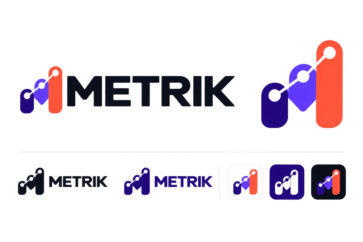
The Master identity — the locked wordmark and logo icon used as the reference for every application view presents the core Metrik SaaS Launch mark and is used as a visual reference for consistent brand application.
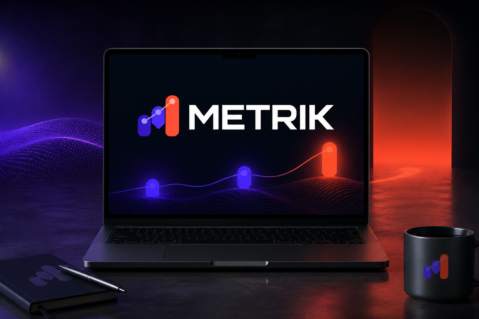
The Data-to-story SaaS launch hero mockup is a reusable social-media format for sharing specific Metrik SaaS Launch news, updates or campaign messages.
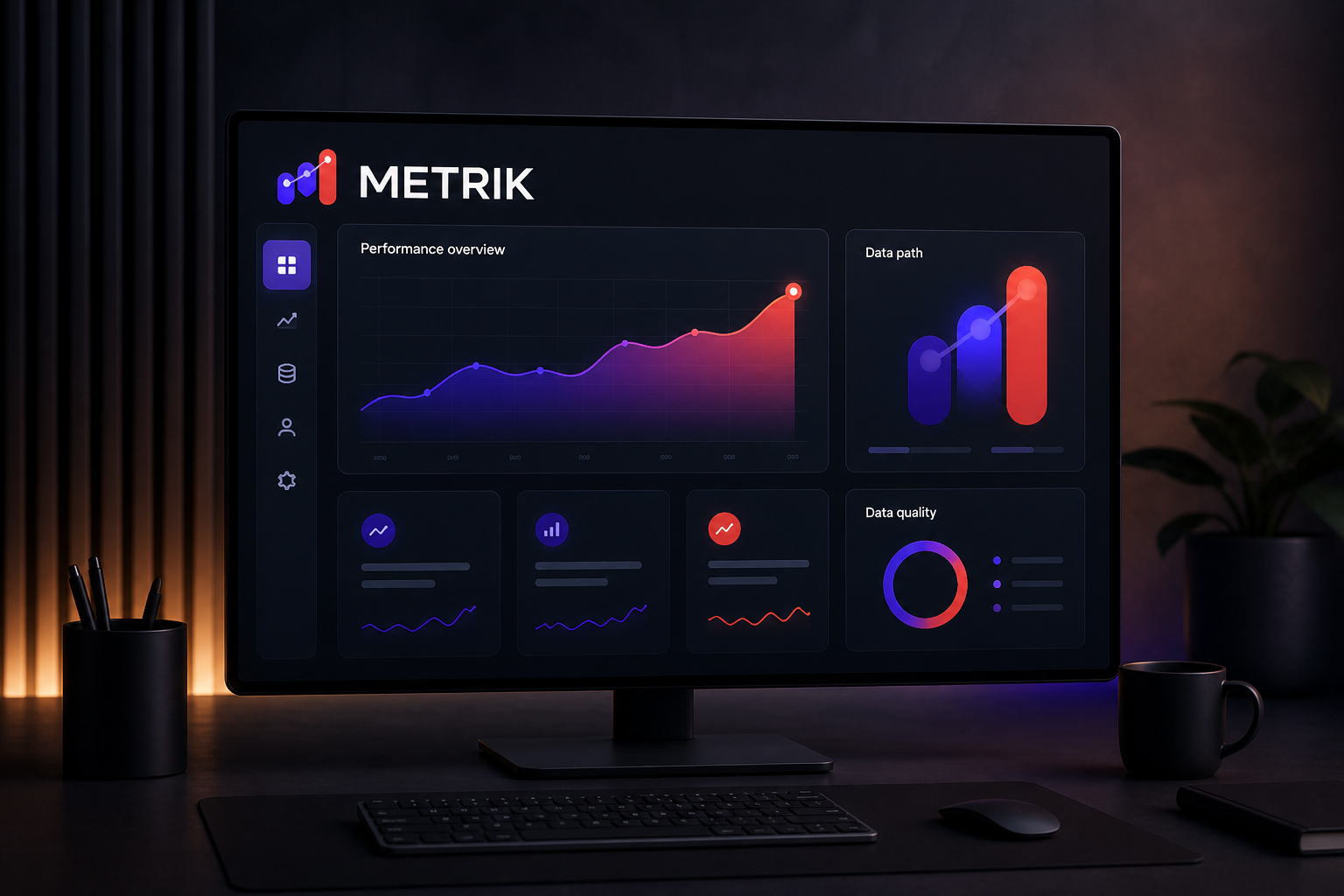
The Responsive analytics marketing homepage mockup presents a specific Metrik SaaS Launch touchpoint and is used to demonstrate the identity in a practical real-world context.
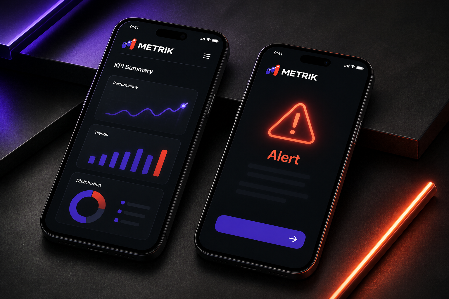
The Mobile KPI summaries and alert experience mockup demonstrates how people use and recognise Metrik SaaS Launch through a practical screen-based experience.
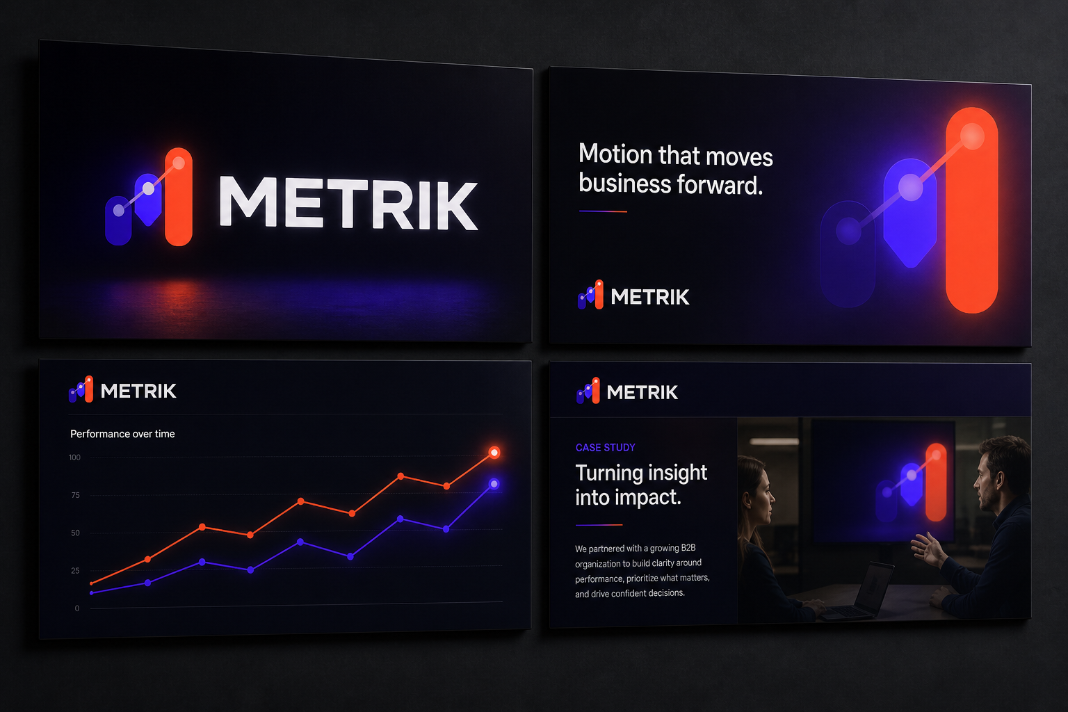
The Executive sales-deck system mockup organises Metrik SaaS Launch information for clear communication with clients, partners or sponsors.
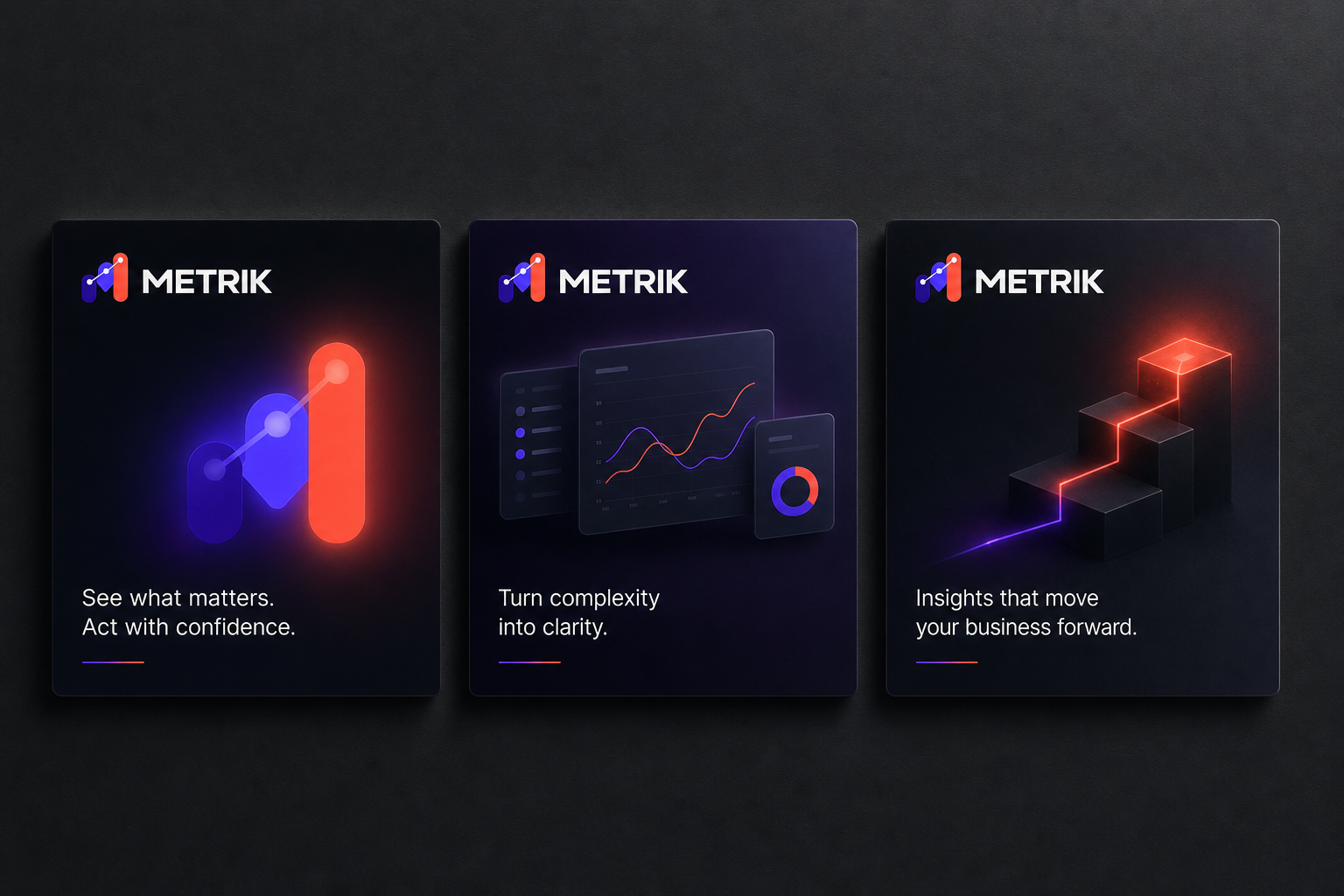
The B2B product-value social campaign mockup is a reusable social-media format for sharing specific Metrik SaaS Launch news, updates or campaign messages.
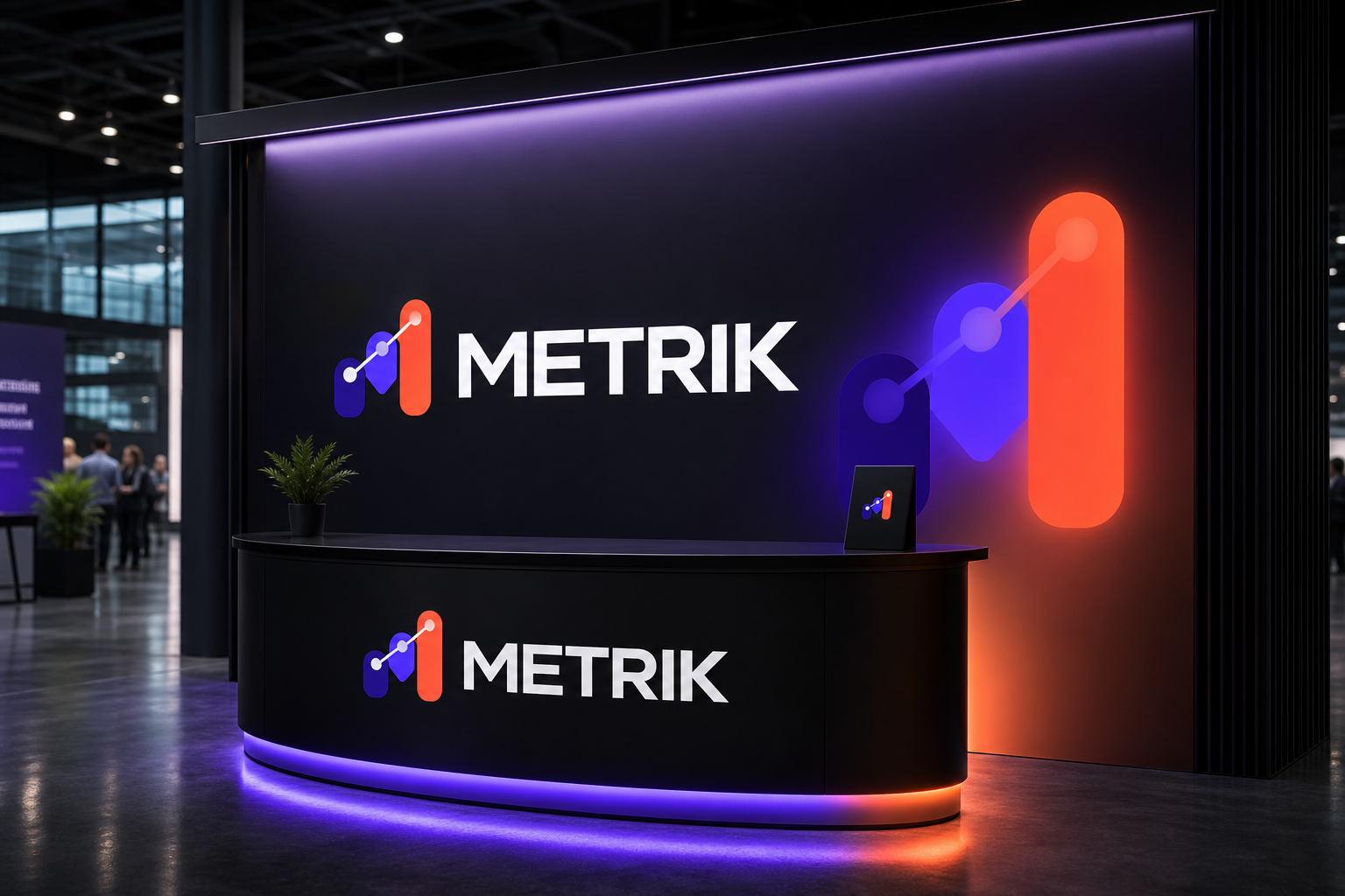
The SaaS conference booth and presentation screen mockup demonstrates how Metrik SaaS Launch guides, informs and creates recognition within a physical space or event.
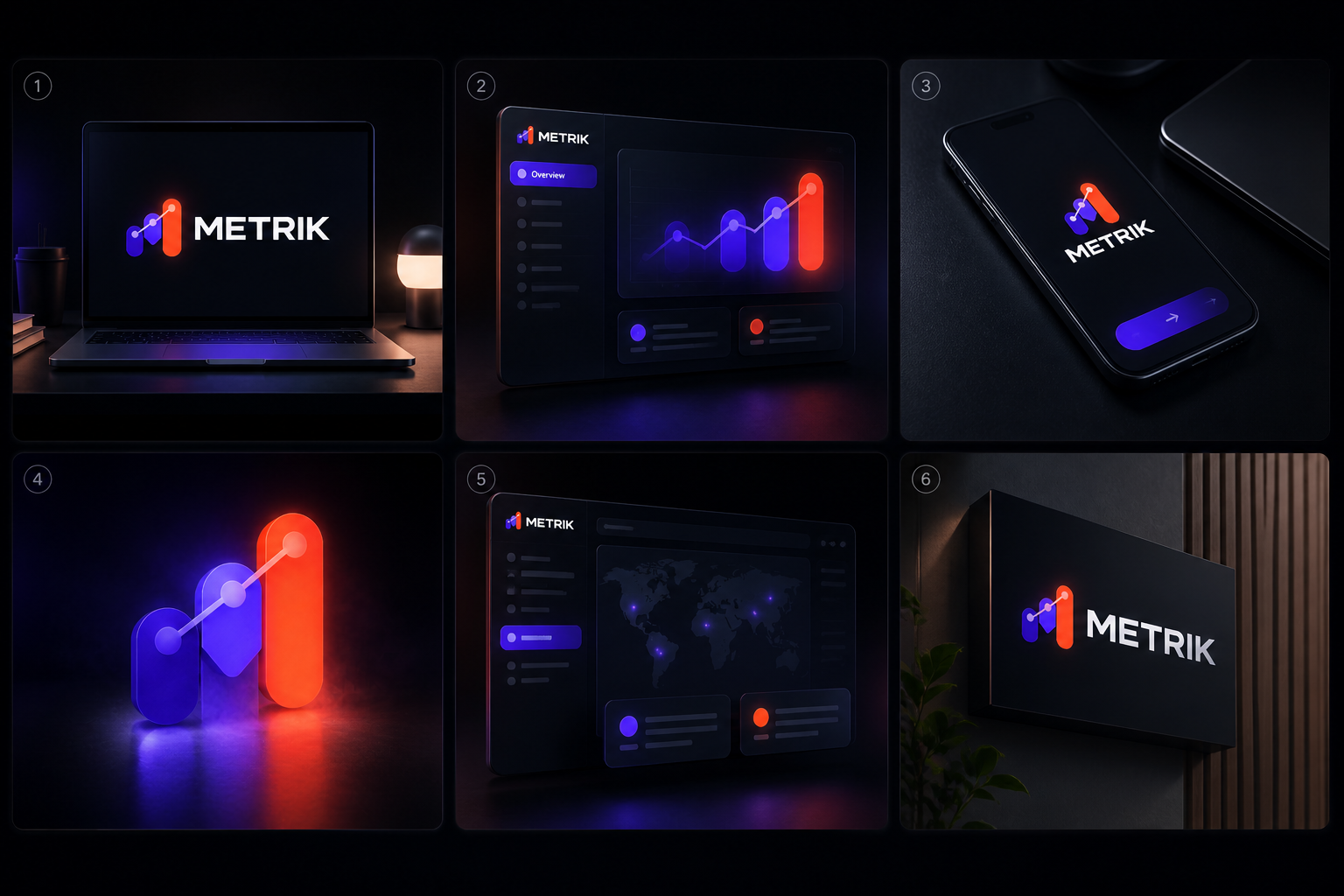
The Six-frame product-explainer motion storyboard mockup is a reusable social-media format for sharing specific Metrik SaaS Launch news, updates or campaign messages.
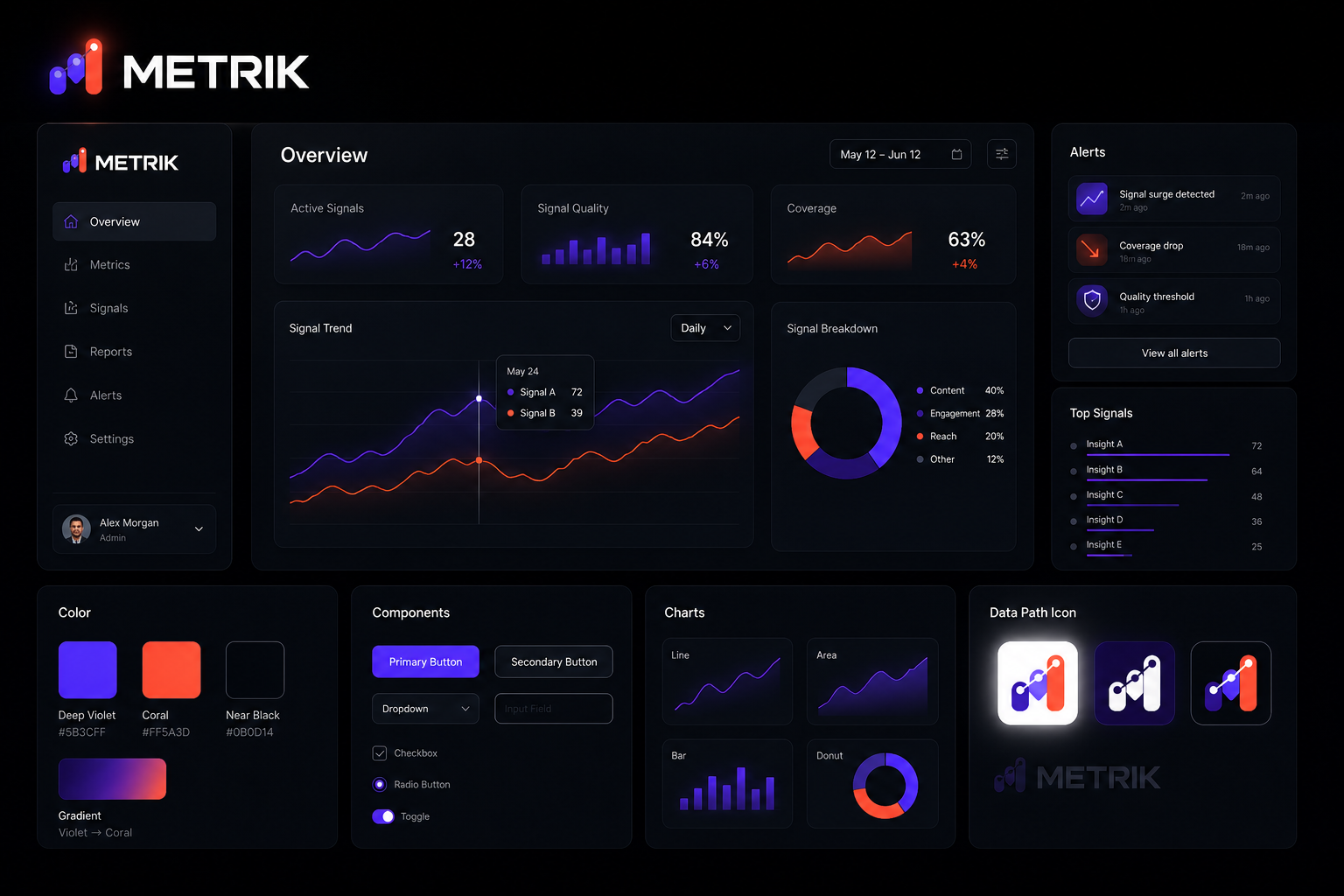
The Accessible dark-mode analytics component system overview combines multiple Metrik SaaS Launch touchpoints to demonstrate consistency across the wider visual system.
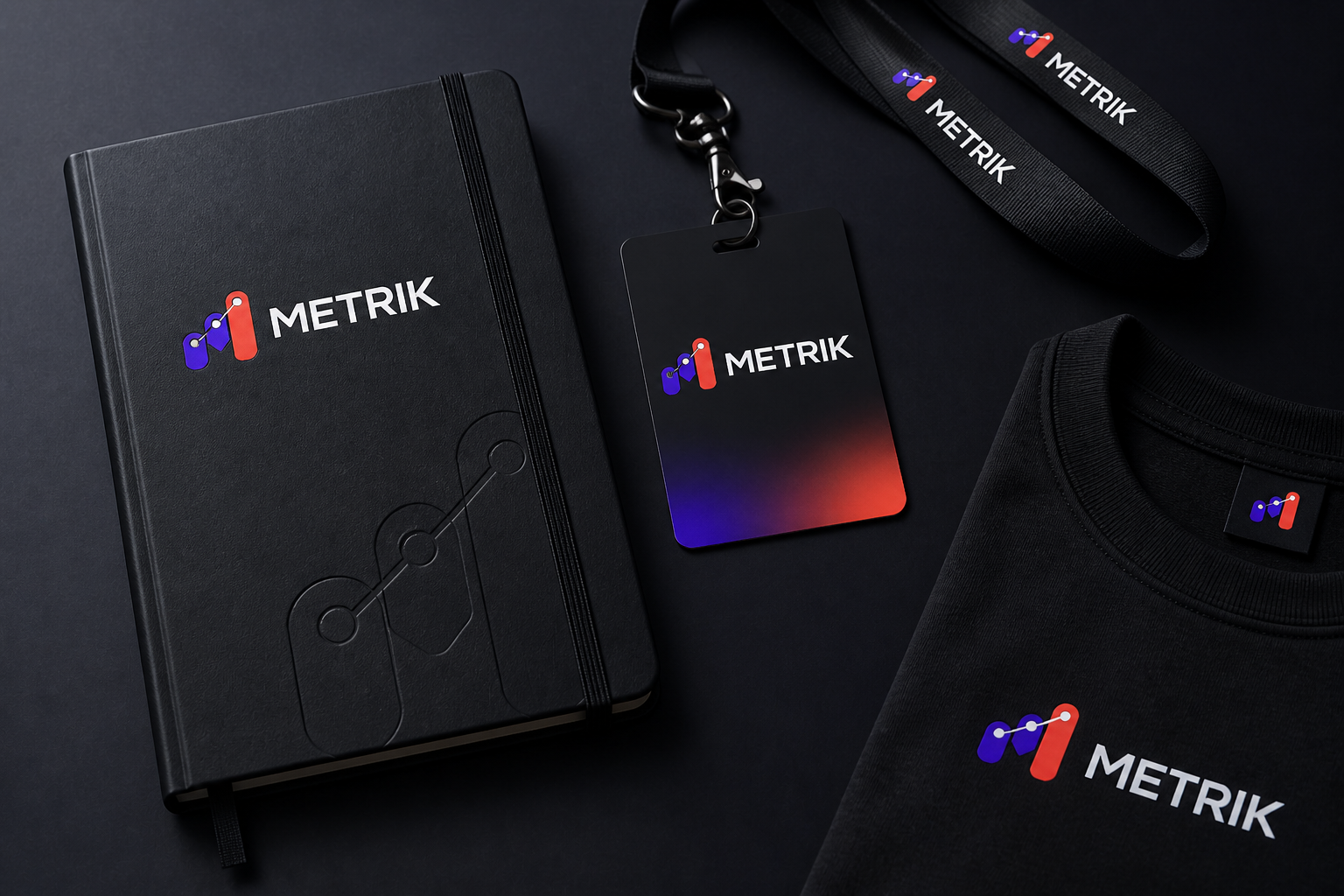
The Team notebook, access card and merchandise mockup is a printed application used to communicate Metrik SaaS Launch information in a professional, tangible format.
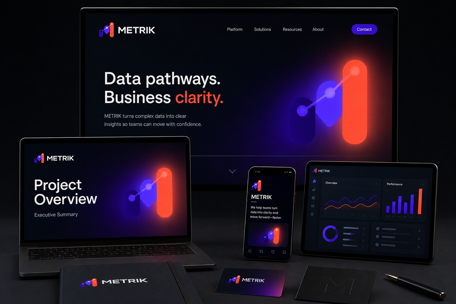
The Closing product-marketing family across UI, sales and motion mockup defines how the Metrik SaaS Launch identity moves across video, screens and social content.
02 / Brief
The challenge
Audience
- Decision-makers who need the offer to be understood quickly and trusted across several touchpoints.
- Desktop and mobile visitors, including keyboard users and people encountering the brand through product or marketing pages.
Objectives
- Create a distinctive ui / web direction that communicates the offer within seconds.
- Show how one strategic idea can become a coherent system rather than a collection of unrelated mockups.
- Demonstrate production awareness and handoff quality expected by international in-house, agency and production teams.
- Make every application useful for its audience, format and stage in the communication journey.
Constraints
- Marketing website must follow the same hierarchy and visual rules while respecting its own format.
- UI component language must follow the same hierarchy and visual rules while respecting its own format.
- Sales deck must follow the same hierarchy and visual rules while respecting its own format.
03 / Creative direction
The design response
A focused message hierarchy, accessible component set and data-to-story motion grammar keep product communication consistent. The intended tone balances confidence with restraint: enough distinction to be memorable, but enough structure to feel credible across international commercial settings. References should be evaluated for strategic principles—hierarchy, rhythm, materiality and behaviour—not copied as surface style.
The core concept turns the project’s central subject into a repeatable visual rule. Each application should express the same idea through scale, sequence, crop or material rather than adding new decoration. The concept succeeds only if a viewer can connect the smallest digital asset with the largest or most detailed application.
04 / Design system
The visual system
Use a disciplined display-and-text pairing with a clear information hierarchy. Headline character supports the ui / web idea; body copy remains neutral, highly legible and suitable for English and multilingual content.
Build a controlled primary palette around the violet direction, supported by neutral and functional colours. Define RGB, CMYK and contrast-safe digital values before final artwork.
Use a modular grid with repeatable spacing, alignment and scale rules so communication remains recognisable from compact formats to long-form and large-scale applications.
Set explicit rules for crop, perspective, background treatment, subject scale and captioning. Imagery must clarify the message rather than act as generic decoration.
05 / Applications
What the project delivers
Responsive digital experience
Desktop, tablet and mobile layouts built from accessible components with documented states, content behavior and handoff notes.
06 / Production & implementation
Designed to leave the portfolio and enter production
- Specify responsive behavior, semantic hierarchy, keyboard and focus states, colour contrast, reduced motion, optimized images and component-level handoff.
Files should use a consistent folder structure, version names, editable masters, linked assets, licensed font notes and export presets. Final public content must pass a permission and privacy check.
07 / Iterations
How I developed the work
- Round 01 — Audit the category, audience, competitors and common visual clichés; write the problem and positioning in one sentence.
- Round 02 — Explore at least three distinct conceptual territories in black and white before committing to typography or colour.
- Round 03 — Test the selected direction on the most difficult real formats, not only the hero image; remove rules that fail under pressure.
- Round 04 — Refine hierarchy, spacing, colour and imagery; run print, contrast, small-size and responsive checks where relevant.
08 / Deliverables & outcome
What the project includes
Project deliverables
- Marketing website
- UI component language
- Sales deck
- Social assets
- Product explainer motion
- Creative-direction board and written rationale
Quality standard
- The audience can identify the offer, category and next action without an explanation from the designer.
- Applications look related because they share rules—not because the same mockup or decorative effect is repeated.
- A production, marketing or development colleague can continue the work from the documented files and specifications.
- Accessibility, privacy and output requirements are resolved before presentation polish.
Project outcome
Metrik brings together marketing website, ui component language, sales deck, social assets, product explainer motion in one coherent, presentation-ready design system.
International portfolio relevance
This case study demonstrates digital brand, product marketing, motion system, cross-media consistency and production discipline for international design teams and clients.
Further development
Further development can extend the system through additional applications, production testing, responsive refinement and implementation detail.
Have a similar challenge?
Let's build something clear, useful and memorable.
Share your company, audience and required deliverables. I will help you identify the right design direction.